
Without composition there is just visual chaos with no beginning or end, no direction or cycle, no shape or difference between dark and light. This series is the go-to resource for compelling visual storytelling in landscape photography as it provides a condensed overview of all the elements that make up a stunning image. This week: Advanced tools that will nick the attention of the viewer and guide them carefully through your photograph.
Viewpoint
Choosing a viewpoint carefully can alter how we perceive the landscape. Consider retracting the tripod when you want to make the immediate foreground appear larger than everything behind it. This will get the camera closer to you subject. If there’s enough foreground interest, that’s a good idea. Conversely, extending the tripod will make everything behind the immediate foreground appear larger. A good subject for illustrating this would that sweeping seascape.


A high viewpoint versus a low viewpoint as you try to image the apparent height of the sea. (Den Helder, the Netherlands)
Perspective
Last week I asked you to take a 50mm plus focal length with you. Now, if you were an avid wide-angle photographer, you would undoubtedly have noticed that something has changed if you’ve tried the same composition with a longer lens. Backgrounds appear bigger in relation to the foreground. In the previous example we didn’t make the background appear larger, rather the attention shifted from the foreground to somewhere in the middle. If you would imagine some mountains in the background and they appear small compared to their stature as seen through your eyes, that’s simply because the wide-angle you are looking through does not enlarge anything. You just don’t do that with altering the viewpoint. Now, you might think that you need to swap lenses in order to make the mountains look as imposing as you see them, but there’s a trick.
Wide-angle lenses distort more at their edges than in the image center. While this means that the edges also show less image quality, the edges effectively smear out your backgrounds when they’re not in the center of the frame.


The image (straight from camera) on the left illustrates this. Notice how the mountain disappears out of the frame? It just pierces through the clouds. The distortion at the wide end (18mm) of this lens is spectacular. The right image shows the exact same location and the same height of the tripod. But now the camera is tilted upward to capture the mountain and the sky above. I even zoomed in to 20mm to not make it appear too tiny. (Lauterbrunnen, Switzerland)
The most time-consuming thing you can do to leverage the human perspective is through perspective or focal length blending. With perspective blending, you make use of that distortion by shooting two or more images which are each angled slightly differently towards your subject. You then blend the images together (by hand) in Photoshop. It is important to note that you can only achieve good results by leaving the tripod in the same place and preferably without any foreground objects sticking through the crossover point (check out the previous before and after image). Those will make your life difficult.
Focal length blending may be even more complicated. Imagine you’re out in the field at the foot of an impressive mountain and you spot these wonderful alpine flowers. While setting up the tripod to capture both those flowers and the ominous looking pinnacles with your wide-angle zoom, you quickly realize that there’s no way to make both appear as impressive as you currently see them. It doesn’t matter. Get close to your flowers and have your zoom lens turned all the way to its widest mark. Click. Now, just as you would shooting a panorama, tilt the lens upward to encompass the mountain. But make sure there’s at least 30 percent overlap between the two images. Click again. You might need more shots to get everything in, but once you’ve got it all, it’s time to zoom in on the area you want to appear larger. And click one last time.
In post, it’s generally just like stitching a panoramic image, but because you’ve used a wide-angle lens, it’s possible you get some weird artifacts when stitching automatically. You will have to do it by hand if these artifacts do appear.

Set the opacity of the top layer to 50 percent and line up the area where you want the blend to start.
The way I blend the longer focal length in is by first making the panorama the top layer and the longer focal length the bottom layer. Select the top layer set it to 50% opacity so you see what you’re doing. Select Photoshop’s transform tool (ctrl+t on PC, cmd+t on the Mac). Right-click the image and select "perspective" from the menu. Now extend the top two points of the image and place them so that a strategic point of where you want the blend to start aligns with the one below it. Now it’s a case of masking the layers to make them blend, but that’s basically it: You’ve made the mountain appear as you saw it with your own eyes.


Making mountains appear as large as you would see them, standing right next to them. And a nice foreground too? It can be done with focal length blending.
Conveying Depth
Depth perception in two dimensional images is a funny thing. In some of the best photographs I’ve seen, I swear I could feel my eyes adjust for the depth in the image. A strong sense of depth can be achieved a number of ways.
1. Layering
Seemingly placing one object in front of the other makes the eye travel inward of the image. It helps a great deal if each of those subsequent layers really do appear to be farther and farther away. By implying receding dark/light contrast the farther away each layer is, the more it does strike the viewer as conveying actual distance. Mist, haze and other particulates caught in the atmosphere really help with this, but it doesn’t hurt to go easy on adding contrast in post either. Don’t just shove the contrast slider all the way to the right, hoping your image will pop. Distant objects do well with less contrast, so apply extra contrast only to nearby objects.

Layering through fog or haze is a solid way to show depth.
2. Placement of ground and horizon
A higher horizon and more ground in the image can help to suggest depth. But only if the foreground is interesting enough. A strong foreground that leads through an interesting middle ground to a helpful background make for some great landscape imagery, so place close attention to what you can find directly in front of you. Then place yourself around that foreground interest at different angles to see how the middle ground and background change in relation to this potential subject. If your image is all about the sky, make sure there’s enough in the sky that helps to suggest depth. Layered clouds or fine cirrus lines help to give direction to the image.
These fine lines in the sky are called cirrus clouds. Waiting for them to make an appearance in this frame, I used them to point towards the center of the image. (Den Helder, the Netherlands)
3. Vectors
Lines. We always seem to read about lines. In photography, lines convey either movement or stillness with a sense of direction and of how big something is. Because lines seem to suggest a direction as well as apparent size of objects in the image, we refer to them as vectors; Quantities that possess a direction and an order of magnitude. Vectors lead the viewer from one element to another. They may take the form of lines, visible or otherwise, created by such things as a gaze of a person in the image, trees with a powerful sense of direction, or rivers leading into the frame.
Vectors come in all shapes and sizes, but they have one thing in common. There are almost never actual arrows in the image, but there might as well be.
There are three types of vectors:
- Those which connect two elements directly to each other, such as two people looking at each other (called dual vectors).
- Those which depart from an element but don’t necessarily arrive anywhere inside the image (called neutral vectors).
- And the most obvious ones: single vectors. These depart from one part of the image and arrive at another, suggesting a single direction.


This particular image is riddled with single vectors; (virtual) lines that aim to guide the viewer in a certain direction while adding a sense of scale. Notice the gaze of the man looking towards "The Falls of Braan." (Dunkeld, Perthshire, Scotland)
4. Lead-in Lines
A line that comes from the edge of the image and leads toward an area of interest is called a lead-in line. It’s the best example of the single vector as it gives a sense of direction, scale, and depth in the process.


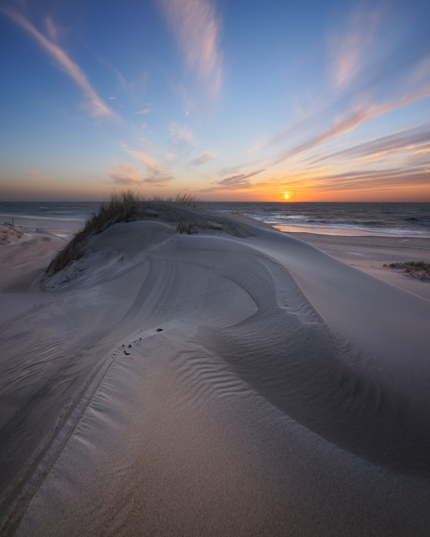
The soft shadows on the sand give a sense of direction, leading in from the bottom left. When we arrive at the image center, we might notice there's a person standing there, looking at the sunset in the distance. It's not a big deal breaker when we do not spot the person's gaze; we are easily drawn to the bright orange sunset anyway. (Schoorl, the Netherlands)
5. The show stopper
The horizon can also be perceived as a line. In fact, it isn’t that hard in most seascapes. But be aware that once you’ve established a powerful lead-in line, it must pass the threshold that is the horizon if you’re looking to connect the sky with the foreground. When the horizon is the most powerful line in the image, it’s best to consider an abstract image and not force a composition. There is one trick to prevent a horizon bisecting your seascape photography, though. If there are one or two elements protruding through the horizon, a connection between the sky and sea is easily made. Try to make use of what is there and work with the elements.

You can always resort to using yourself as a way to omit the compositional show stopper that is a completely flat horizon. (Den Helder, the Netherlands)
6. Curves
Curves are strange lines. While straight lines create motion and speed, curves slow us down in the image. It’s why photos with curvy foregrounds make us look longer.
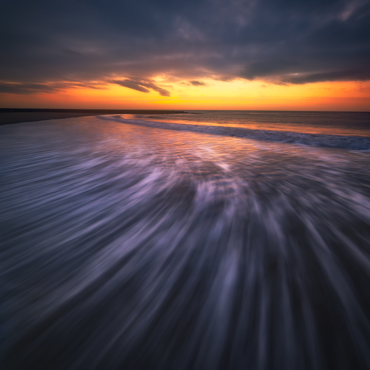
Curves make you linger in an image, while straight lines often add speed and a clear direction. (Den Helder, the Netherlands)
7. Converging lines
wide-angle lenses especially create a disparity between something in the foreground and something in the background by apparent size. The best example is the (abandoned) train track. Of course the wide-angle will pronounce the difference by a greater sense of convergence than the normal or telephoto lens, but all lenses create the same converging lines. They don’t always have to be a result of optics, though. If you place yourself along the trunk of a fallen tree and snap an image with it in the bottom corner as it points toward a center of interest in the image, you’ve got yourself a set of useful converging lines. The base of the trunk is thicker than the part that would normally reach for the sky, so it actually does converge.

The wide-angle distortion creates strong converging lines. And it really does help when they end up at the main attraction of your image. (Julianadorp, the Netherlands)
8. Focus
I don’t often see the use of selective depth-of-field in landscape images, but a good contrast between sharp and blurry is also a very useful tool in your pursuit of more attractive compositions. It’s definitely an area where landscape photographers could learn from portrait and macro photographers.
9. Shapes
Shapes, particularly triangles, are good indicators of direction and depth as well. Consider the following image:


In the example above, I tried looking for shapes that make apparent triangles when looking through the viewfinder. While I confess I was lucky to capture a couple of lapping waves just as the sun set, I do stress that you try to make use of the dynamic properties of the landscape. Water, clouds, but also the direction of the trees as they sway in the wind give away motion and direction if you use them to your advantage. (Den Helder, the Netherlands)
Always Strive to Improve Your Composition Skills
Becoming a better photographer is to never stop learning. And never stop experimenting. Why not invent a “rule of fifths”? Or work with pi (3.1415) instead of the golden mean (1.618) to come up with new and interesting compositions? Leveling up your composition skills isn’t actually that hard. It’s a matter of doing, rather than overthinking. What makes it seem difficult is all the complex naming we attach to everything we identify. That’s why I tend to go easy on explaining everything away through words such as central compositions, or asymmetrical compositions packed with the austerity principle. But much like learning any other language, once you master the language of visual design, you can express yourself through it. So let’s look at some other stuff you can use to tell a story through landscape photography. The next article is about how luminosity affects the way we perceive photography. Spoiler alert: Yes, we'll discuss luminosity masking as well. See you next week!
All images by Laanscapes Photography / Daniel Laan.


Very interesting article. While I've heard of most of these ideas, I'd never heard of, or thought of, focal length blending. I definitely need to try that. I'm already considering ways to use that for my industrial photography as well.
Thanks a lot for these articles.
Many thanks for your articles and all the information. I am waiting for the next one 'luminosity', and wonder if the English text is a translation of a Dutch one, wich is more comprehensive for me.
Hey Eddy,
Good to know you've enjoyed the articles. These aren't translations though. All of my articles on Fstoppers are originally written in English. I might do something for Zoom.nl again in the future, but the advanced stuff doesn't reach too many budding Dutch photographers. Many terms have originated from English as well, so it's probably better to keep it in the original language.
Many thanks,
Daniel
5 Star read, thanks again Daniel