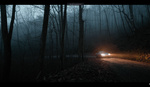
There are many staple looks in cinematography and they are popular for good reason. One is the classic blue or teal and orange, and while it's easy to execute in theory, striking the right balance can be tricky. In this video, go behind the scenes of a video shoot to learn how they balanced everything out.
Many of the most famous movies in history are identifiable almost exclusively by their color grade. That is, there is a color palette that not only sets the mood and themes of the movie, but gives it identity too. There are common color pairings that are almost always decided by the complementary color wheel. Arguably the most famous of them is blue or teal with orange.
I have used these colors on several occasions in my editorial work and I still enjoy the way they look, albeit loosely expecting the style to age poorly. The first time I tried those colors, however, I realized it's not as simple as blasting the scene with both colors from different angles. The balance of the color tones is imperative to the final image.
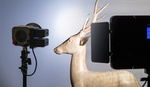
In this video, cinematographers Alissa Rooney and Valentina Vee set up a dramatic scene with varying lighting techniques and tricks to learn from.


Whilst this video is interesting, I find the teal and orange look in photography and cinematography far too overused. I do wish certain looks didn’t become fashionable and people strive to be more unique and individualistic. No matter how good the photographer, photos colour edited to teal and orange just look like a pre-purchased filter.